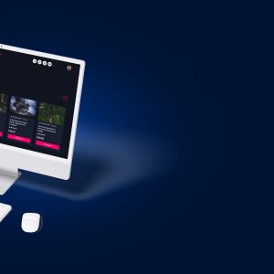
First impressions matter, whether it’s a new user logging into your LMS for the first time or a long-time employee dipping into a refresher course, the design of your platform sets the tone. If it’s clunky, cluttered, or full of blurry stock photos, you’re not exactly inspiring confidence or engagement.
That’s why great platform design isn’t just a “nice-to-have”, it’s a critical part of delivering a successful learning experience.
Why design matters in e-learning
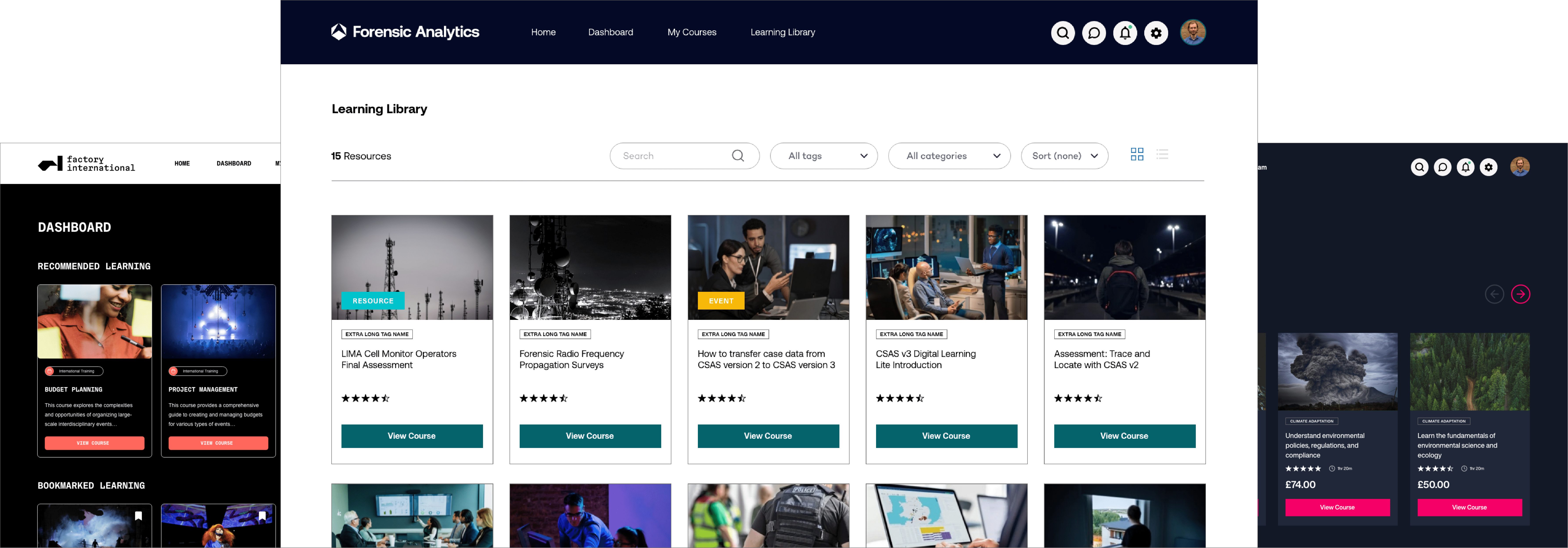
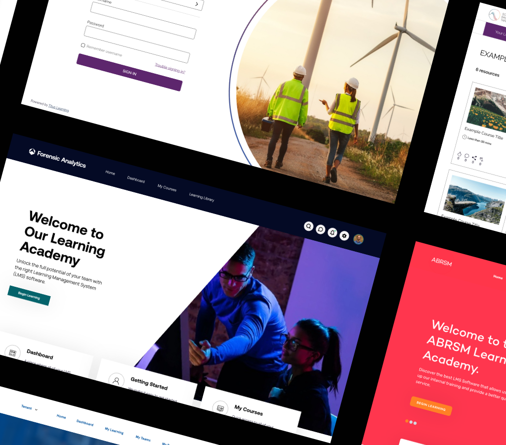
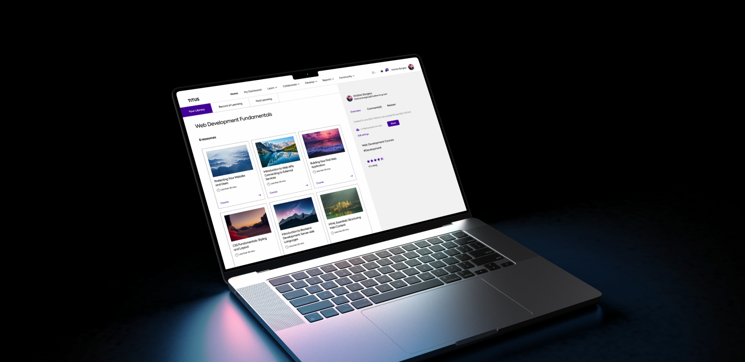
When we talk about design, we don’t just mean colours and logos (though yes, those are important). We’re talking about the overall visual identity of your LMS: the layout, the use of space, how intuitive the navigation is and, crucially, the imagery used throughout your site.
Here’s why it matters:
- You have 50 milliseconds to make a good first impression
- 94% of first impressions are design-related, and 75% of users judge a site’s credibility based on its aesthetics.
- It takes 2.6 seconds for a user’s eyes to land on the area of a website that most influences their first impression.
This applies to websites and LMS platforms. If your learners are put off by an outdated or inconsistent design, it’s going to impact their motivation to learn.
Source: CXL, 2019
The role of imagery
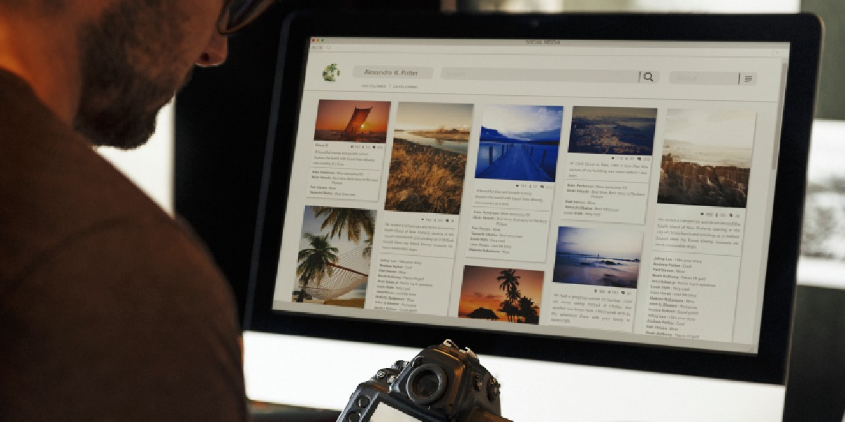
One of the most overlooked elements in LMS design is imagery. Think of it as the body language of your platform, it says more than you think.
Bad imagery (like irrelevant stock photos, inconsistent icon styles, or poor-quality banners) can quickly undermine your credibility and make even high-quality course content feel unprofessional.
Here’s what good imagery does:
It strengthens your brand.
Every image is an opportunity to reinforce your brand’s personality and tone of voice. Whether that’s professional and polished, fun and playful, or bold and innovative, your visuals should reflect it.
It builds trust and credibility.
When learners see cohesive, high-quality visuals across your LMS, it creates a sense of care and attention to detail. That can go a long way in making users take your content more seriously.
It improves accessibility and understanding.
Great imagery can help explain complex topics, support different learning styles, and break up walls of text to make content more digestible.
So, what kind of images should you be using?
Here are a few practical tips we share with clients during our Platform Design Optimisation sessions:
Use consistent image styles
Whether that’s flat illustrations, iconography, or real photography, pick a visual language and stick to it throughout the platform.
Choose images that are relevant to your learners
Generic corporate handshakes just won’t cut it anymore. Use visuals that reflect your actual workforce, industry, and culture.
Optimise image quality for the web.
Avoid pixelated uploads or unnecessarily large files that slow down your platform. Crisp and clean is the name of the game.
Customise where possible.
Custom-designed banners or course thumbnails that align with your brand guidelines instantly elevate the look and feel of your LMS.
Ready to Make Your LMS Look as Good as It Performs?
If you’re nodding along thinking “Yep, our platform could definitely use a visual upgrade,” you’re not alone, and we’re here to help.
Our Platform Design Optimisation Service is designed to give your LMS a design refresh that makes an immediate impact. From custom imagery to full visual branding audits, we’ll help you create a cohesive, engaging learner experience that reflects the quality of your content.
Get in touch with the Titus team today to chat about how we can bring your LMS design up to scratch and make it something your learners actually want to log into.
Contact us today to find out more