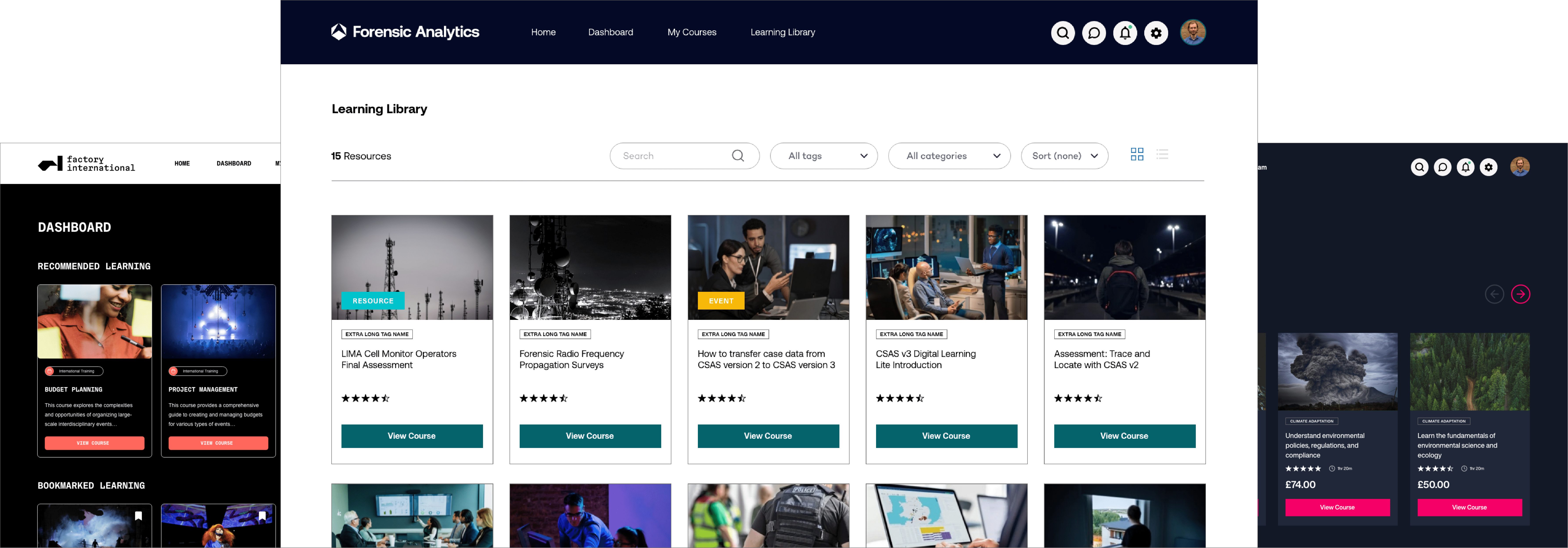
Over the past seven years, mobile technology has advanced at a rate most didn’t expect; tablet devices are now far more ubiquitous than anyone (except maybe Apple) ever imagined, plus the novelty of smartphones hasn’t worn off. With so many different devices by numerous manufacturers, it’s inevitable there are going to be many different screen sizes.
Responsive design allows the design of your learning platform’s pages to move fluidly between different screen sizes. No matter what the device, the elements of the pages – like menus, footers and images – will adapt to how they’re being viewed, making it easier for the viewer to read, write, navigate and more.
It means, for students, accessing learning is easier whatever the device they’re using; chances are they will switch between devices to access the same thing. Therefore, a fluid learning platform design is no longer a nice to have – it’s an essential feature.
So, here are five reasons why you should always ask for responsive design from your e-learning provider.
Access learning from any device
Responsive design means whatever the device, the learning experience is the same.
This means, from an educator’s point of view, you can encourage students to learn from home – and their learning can fit around their lifestyle. As long as they have a device (with an internet connection, of course) they can access and use your learning platform easily.
Publish content easily
That ease of access extends to you, the educator. Publishing content – like courses – or even adding notices, responding to students’ messages and checking coursework can all be done simply and quickly, however you choose to access your school’s learning platform.
Your learning platform is future-proof
You only have to think about the mobile phones we were using ten years ago to realise that technology moves pretty fast – and today, mobile technology certainly isn’t an exception. Ten years ago we weren’t even using tablets – so where will we be in another ten years?
Responsive design means it doesn’t matter how much device screen sizes change, your learning platform will adapt to fit them. A fluid design is one of the best solutions for future-proofing your learning platform, ensuring it stays up to date as mobile technology advances.
It’s easier for those less tech-savvy
Members of your teaching staff who aren’t so tech-savvy will love the fact responsive design alters the layout of each page depending on the size of the screen they have – but always with ease of use in mind. Gone are those days of squinting into the screen of a smartphone, trying to find the menu. If each page of your learning platform is fluid, the user experience is more enjoyable – and that’s most important when it comes to users who don’t have the technology experience that your students may have!
Your students will be happier learners
You can’t control the device – or devices – that each student uses to access their learning. However, with responsive design that’s not an issue – and, if accessing and navigating around your learning platform isn’t a chore, you’ll have happier learners. Happy learners means students who want to learn!
To find out more about responsive design for your learning platform, get in touch with the Titus team here.


